


Want to make your Pinterest pins pop? Color choices can make or break your success on this visual platform. Getting the right mix of colors isn’t just about making things look pretty. It’s about catching eyes and stopping thumbs mid-scroll.
Warm colors like red, orange, and brown get twice as many repins as cool tones like blue. This insight from Pinterest’s own data shows exactly what catches people’s attention. Think sunny beach vibes instead of cloudy winter days.
Your pins compete with millions of others every day, so picking the right colors gives you a real edge. The good news? You don’t need a design degree to create eye-catching pins. With the right color combinations, your content can stand out in the Pinterest feed and attract more clicks to your website.
Understanding Pinterest’s Color Palette
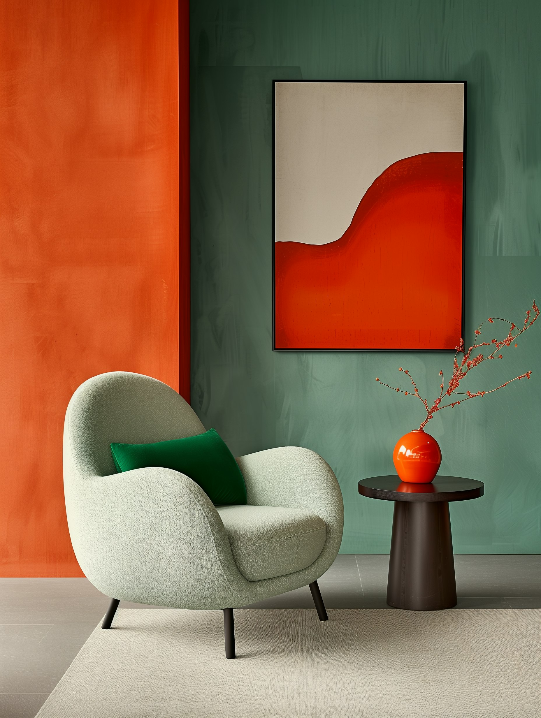
Pinterest’s 2025 color palette features five standout shades that will shape everything from home decor to fashion: Cherry Red, Butter Yellow, Aura Indigo, Dill Green, and Alpine Oat.
The Impact of Color in Pins
Your Pinterest content needs the right colors to grab attention and stop those endless scrolling thumbs. Think of color as your secret weapon for getting more saves and clicks.
The 2025 palette gives you fresh ways to make your pins pop. Want to get fancy? Try pairing Butter Yellow with Aura Indigo for a bold contrast that’ll make your viewers say “wow.”
Pro tip: You don’t need to use all five colors at once. Pick 2-3 that match your brand vibe. Alpine Oat makes an excellent neutral base that lets the other shades shine.
Decoding the Pinterest Predicts Report
Pinterest didn’t just randomly pick these colors out of a crayon box. They analyzed millions of searches and pins to spot rising color trends before they hit mainstream.
Cherry Red is heating up in fashion pins, while Dill Green is taking over home decor boards like nobody’s business.
Want to stay ahead of the curve? Try using these colors in your:
- Product photography
- Graphics and text overlays
- Mood boards
- Brand elements
The best part? These aren’t just trendy shades – they’re actually super usable. Even that bold Aura Indigo can work magic when used as an accent color.
Current Color Trends on Pinterest
Pinterest’s latest color predictions show what’s hot right now and what’s coming next. The platform’s massive user base helps spot emerging trends before they hit the mainstream.
The Trendsetters: Colors of the Year
Cherry red is stealing the spotlight in 2025! You’ll see this juicy shade popping up everywhere from makeup looks to home decor. It’s giving major main character energy, and we’re here for it.
Butter yellow has joined the party too. This warm, cozy shade feels like sunshine in color form. Perfect for adding some happy vibes to your space without going overboard.
The surprise guest? Alpine oat – think sophisticated neutral with a twist. It’s like the cool, calm friend who somehow makes everything look better.
Rising Stars: Trending Colors to Watch
Purple is making waves (yeah, we were surprised too). Gen Z and millennials are particularly vibing with this nostalgic shade. Love it or hate it, purple’s not going anywhere in 2025.
Your Pinterest boards will soon be filled with these bold-meets-wearable colors. They’re showing up in:
- Wall paint choices
- Fashion trends
- Makeup looks
- Home accessories
- DIY projects
Pro tip: Try mixing these trending colors with your existing palette. Even small pops of cherry red or butter yellow can make a big impact!
Creating a Cohesive Color Scheme
A cohesive color scheme brings your visuals to life and helps you build a memorable brand presence on Pinterest. The right colors can make your pins pop and get more engagement.
The Psychology of Color in Design
Colors affect how people feel and act when they see your pins. Red gets people excited and hungry – perfect for food pins! Blue creates trust and calm, which works great for business content.
Want to boost engagement? Try using warm colors like orange and yellow to grab attention. They make people feel energetic and optimistic.
Green represents growth and nature. It’s ideal for wellness, money, and outdoor content. Purple adds a touch of luxury and creativity to your designs.
Mixing and Matching: Complementing Colors
Start with 2-3 main colors that reflect your brand personality. Think about what makes sense for your content type.
Color harmony tips:
- Pick one dominant color (60%)
- Add a secondary color (30%)
- Use an accent color (10%) for special elements
Don’t be afraid to play with light and dark shades of your chosen colors. This adds depth without making things messy.
Test your color combos in different lighting conditions. What looks good on your phone might appear different on someone else’s screen.
Pro tip: Save your favorite color codes somewhere handy. You’ll want them for keeping your pins consistent!
Branding and Graphic Design on Pinterest
Pinterest helps millions create beautiful brand identities through color and design inspiration. Your brand’s visual elements can make or break how people connect with your business.
The Role of Color in Branding
Colors speak louder than words when it comes to your brand personality. Pick the wrong palette and you might send mixed signals to your audience.
Your brand colors need to match your vibe – are you going for luxe and sophisticated? Earthy and organic? Fun and playful? There’s a palette for that.
Pinterest is packed with pre-made color schemes that take the guesswork out of branding. Just search terms like “boho brand colors” or “minimalist color palette” to find your perfect match.
Pro tip: Save your fave color combos to a dedicated board. You’ll thank yourself later when you need to reference them for your website or social posts.
Graphic Design Colors That Captivate
Want your pins to stop scrollers in their tracks? The right color combo can make that happen.
Popular pin color schemes in 2025 lean toward:
- Jewel tones for luxury brands
- Earth tones for sustainable businesses
- Pastels for lifestyle content
- Bold neons for tech and innovation
Mix up your graphics with 2-3 main colors plus an accent shade. This keeps things interesting without looking chaotic.
Test different color combinations on your pins and track which ones get the most saves. Your audience will tell you what works through their engagement.
Remember: Pinterest is visual-first. Your graphics need to pop on mobile screens where most pinners browse.
Putting It All Together: Crafting Your Pinterest Palette
Creating a winning color palette takes both creativity and strategy. The right colors can make your pins pop and help build a memorable brand presence.
Selecting Colors That Align With Your Aesthetic
Start with Pinterest’s 2025 trending colors as inspiration – Cherry Red, Butter Yellow, and Aura Purple lead the pack. These shades pack a punch while staying fresh and modern.
Mix and match 3-4 colors max for your main palette. Too many colors can make your pins look messy and confusing.
Pro tip: Test your palette choices on a few sample pins before going all-in. What looks good in theory might not translate well to actual Pinterest graphics.
Staying Authentic and True to Your Style
Don’t feel pressured to use trendy colors just because they’re popular. Pick shades that match your brand personality and make you excited to create content.
Play around with different color combos until you find your perfect match. Try pairing bold shades with neutral tones for balance.
Quick color psychology check: Make sure your chosen palette sends the right message. Red energizes, yellow brings joy, purple adds mystery and creativity.
Trust your gut! If certain colors don’t feel right for your brand, skip them – regardless of what’s trending.
Frequently Asked Questions
Pinterest color trends change fast, and picking the right ones can feel tricky. Let’s tackle the most common color questions to help you create eye-catching pins that people actually want to click.
What color palette is totally in for this season’s fashion?
Soft sage greens and warm terracotta are stealing the spotlight right now. These earthy tones work great with cream and beige accents.
Mix in some muted lavender for a fresh twist. This combo feels super current without trying too hard.
Which color combos will make my Pinterest boards pop?
Deep navy with coral is a killer combo that grabs attention without being too loud. Try pairing it with white text for maximum impact.
Rich emerald green with gold accents never fails to turn heads. This duo gives your pins that luxe feel users love.
Any fresh color trends I should be following for my Pinterest aesthetics?
Dusty blues paired with warm browns are having a moment. This combo feels both modern and cozy at the same time.
Burnt orange and cream are gaining serious traction. Add a touch of olive green to make this palette really sing.
How can I choose colors that will attract more eyes to my Pinterest content?
Start with one bold color as your base – think bright red or electric blue. Then add two softer shades that complement it.
Test different combinations with small batches of pins. Track which colors get more saves and clicks.
Looking for the colors that are the talk of the town for nails on Pinterest. Any tips?
Chrome effects in rose gold and silver are everywhere right now. These metallic shades photograph beautifully for Pinterest.
Milk bath pastels with a glossy finish are also crushing it. Think soft pink, baby blue, and mint green.
What’s the secret to creating a Pinterest color palette that feels like 2025?
Mix natural tones with unexpected pops of neon.
Think mushroom gray with electric yellow or forest green with hot pink.
Keep your base colors consistent but rotate accent colors monthly.
This keeps your feed fresh while maintaining brand recognition.
Use color psychology to your advantage.
Warm tones work well for food pins, while cool tones are great for tech content.


Comments +