


Pinterest is a visual wonderland where images reign supreme. If you want to make your mark on this platform, you need to know how to create eye-catching visuals that stop scrollers in their tracks. But it’s not just about making pretty pictures – you’ve got to optimize them too.
When you understand what makes Pinterest users tick, you can create pins that don’t just look good but actually drive traffic to your website.
The secret sauce? Vertical images with a 2:3 ratio that instantly grab attention, match your brand style, and include smart keywords in your descriptions. This isn’t rocket science, but it does take some know-how.
Whether you’re promoting blog posts, products, or services, your Pinterest strategy needs to focus on visuals that inspire action.
And don’t worry—I’ll help you figure out how to create pins that not only get saved but actually send real people to your site.
Key Takeaways
- High-converting Pinterest images use vertical formats with 2:3 aspect ratios and brand-consistent designs.
- Eye-catching visuals combined with keyword-rich descriptions dramatically improve discovery in Pinterest searches.
- Strategic pin creation turns casual browsers into active visitors, transforming Pinterest from a visual platform into a traffic-generating machine.
Starting With the Basics: Pinterest Image Specs
Let’s talk about making your Pinterest images pop! I’m going to break down everything you need to know about image specs so your pins can shine in that crowded feed.
Pin Size Secrets Revealed
Want your pins to look sharp? Size matters on Pinterest! I recommend going with 1000×1500 pixels for standard pins. This sweet spot works amazingly well across all devices.
Quick size tips:
- Minimum size: 600×900 pixels (go smaller and things get fuzzy)
- Maximum file size: 20MB
- Best file types: PNG or JPEG
Pinterest converts everything to standard 8-bit RGB JPEGs anyway, so don’t stress too much about fancy file formats. Keep it simple!
Playing the Aspect Ratio Game
The aspect ratio is your secret weapon for Pinterest success. The golden ratio is 2:3 (width). This means your image should be 1.5 times taller than it is wide.
Why is 2:3 so magical? Three reasons:
- It displays perfectly in feeds
- It looks great when expanded
- It won’t get chopped off by Pinterest’s display systems
You can stretch it to 1:2.1 if you need more vertical space, but don’t go taller or Pinterest might trim your masterpiece. Square images (1:1) work too, but they won’t grab as much attention.
Pro tip: Pick one ratio and stick with it for your brand. High-quality images with consistent dimensions help people recognize your content at a glance!
Design Like a Pro: Creating Pins That Pop
Making Your Visuals Stand Out
Visual content is everything on Pinterest! I’ve found that pins with bright colors and clean designs get way more clicks than cluttered messes.
When I create pins, I stick to the 2:3 ratio that Pinterest loves (think tall and narrow, not short and wide).
Your pins need to:
- Grab attention instantly
- Have readable text even on mobile
- Include your brand elements (logo or website)
Keep your designs simple but eye-catching. Too many elements fighting for attention will make people scroll right past.
I always ask myself, “Would I stop scrolling for this?” If the answer is no, it’s back to the drawing board!
Remember to add keywords to your pin descriptions too. This isn’t just about looking pretty—it’s about being found in searches!
Canva: Design Magic for Non-Designers
Canva has been a game-changer for my Pinterest strategy. This tool makes creating professional-looking pins super easy, even if you don’t know your kerning from your color theory.
Here’s my quick Canva process:
- Start with a Pinterest-sized template (1000 x 1500 pixels)
- Pick a simple layout that highlights your main image
- Add bold text that’s readable at a glance
- Include your branding elements
Try different font combinations—I like pairing a bold headline with a simpler supporting font. And don’t be afraid to test different designs! I’ve been surprised by which pins take off and which ones flop.
Play with contrasting colors to make your text pop against the background. Dark text on light backgrounds (or vice versa) works wonders for readability!
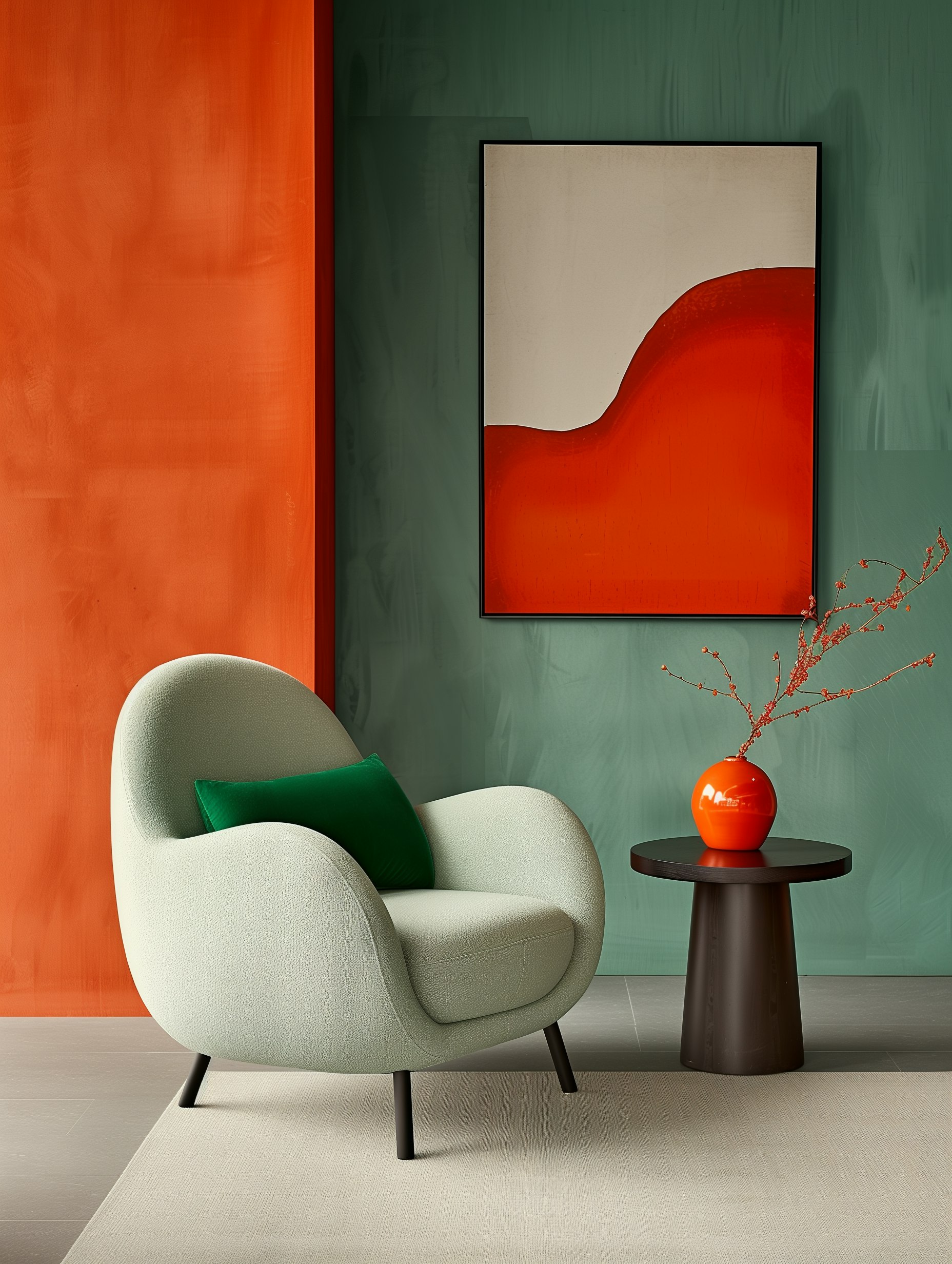
Color and Contrast: Creating Your Dream Color Scheme
The Secret Language of Colors
Colors do more than just look pretty—they talk to our brains! Red gets us fired up while blue helps us chill.
When I’m designing pins for clients, I’m always thinking about what emotions I want to trigger.
Want to make people click? Try orange buttons—they practically scream “do it now!” Need to suggest wealth or growth? Green is your go-to. And purple? It gives everything that luxury feel without trying too hard.
Before picking colors, ask yourself:
- What do I want viewers to feel?
- What action do I want them to take?
- Does this match my brand personality?
Quick Color Mood Guide:
| Color | Feeling | Best For |
|---|---|---|
| Red | Excitement, urgency | Sales, alerts |
| Blue | Trust, calm | Professional content |
| Yellow | Happiness, energy | Creative projects |
| Green | Growth, nature | Natural products, finance |
Remember that colors can mean different things around the world. What works in one country might send the wrong message in another!
Keeping Your Look Consistent
I can’t stress this enough—jumping around with different colors makes your Pinterest account look like a chaotic mess. Nobody wants that!
Pick 3-5 colors that represent you and stick with them. When someone’s scrolling through Pinterest at lightning speed, they should be able to spot your pins instantly.
My favorite trick? I create a simple color palette card that I keep on my desktop. Every time I make a new pin, I check it against my palette. This has saved me from color chaos so many times!
For a natural look, try including:
- Earth tones
- Soft greens
- Muted blues
- Warm neutrals
These create that effortless vibe that feels authentic rather than overly designed. Just remember to keep your colors consistent while allowing for some creative flexibility. Your followers will thank you!
Typography Tips: Making Words Stand Out
Let’s face it – good typography can turn a so-so Pinterest pin into something people actually want to click on. I’ve learned this the hard way!
Font selection matters big time. Choose something people can read without squinting, but with a bit of personality. Mix it up by pairing a serif with a sans-serif for that eye-catching contrast.
Play with size to create hierarchy:
- Make important words HUGE
- Keep secondary info smaller
- Use size to guide the eye
Colors should pop but still be readable. Nothing worse than yellow text on a white background, am I right?
Alignment tricks:
- Center text for elegant vibes
- Left-align for easy reading
- Match alignment with image contours
Give your text room to breathe! Cramped letters are like people stuffed in an elevator – uncomfortable for everyone involved.
I love layering text over images for added depth. Just don’t cover the best parts of your picture! And please, keep it brief. Pinterest isn’t the place for your novel.
Bold, italics, and ALL CAPS have their moments – just don’t use them all at once unless you want your pin looking like it’s having a typography tantrum.
Infographics: Telling Stories Through Data
Let’s be honest—nobody gets excited about a wall of numbers. But turn those same stats into a colorful visual story? Now you’ve got something people actually want to look at!
I’ve found that great infographics do more than just present data—they tell a story. When I create infographics for Pinterest, I follow these simple rules:
Key Elements of Eye-Catching Infographics:
- A single, clear focus (don’t try to explain everything!)
- Logical flow from top to bottom
- Bold visuals that grab attention
- Minimal text (think headlines, not paragraphs)
- A color scheme that pops but doesn’t overwhelm
The magic happens when you break down complex ideas into small, digestible pieces. I’m talking simple icons, short text blurbs, and layouts that make sense at first glance.
Pro tip: Stick to 2-3 main colors that match your brand vibe. Use contrast to highlight the important stuff and guide people’s eyes through your story.
Remember, your infographic is competing with thousands of other images. Make yours stand out by creating something that actually connects with people. The best visual storytelling doesn’t just inform—it sparks emotion and makes people want to share what they’ve learned.
Lights, Camera, Roll: Videos That Wow on Pinterest
Making Your Pinterest Videos Pop
Let’s face it – video is taking over Pinterest! With static Idea Pins on their way out, it’s time to jump on the video bandwagon. I’ve found that creating eye-catching videos isn’t as hard as it seems.
Start with a bang in those first 3 seconds. You’ve got to hook viewers fast! Keep your videos short and sweet (6-15 seconds works great). Remember that most people watch without sound, so add text overlays to get your point across.
Quick Video Tips:
- Film vertically to take up more screen space
- Choose thumbnails that make people want to click
- Add subtle branding (but don’t overdo it!)
- Show your products or services in action
I love experimenting with different styles like:
- Stop-motion
- Time-lapse
- Quick how-tos
- Before-and-after reveals
Keeping Eyes on Your Content
Videos work magic for engagement! They tell your story faster than static images ever could. When I started using video pins, my watch time and saves jumped up immediately.
Give viewers a treat by showing your products from all angles or demonstrating how to use them. People eat up behind-the-scenes content that shows how you make your magic happen.
Don’t leave viewers hanging – always include a clear next step:
- Visit your website
- Try your tip
- Save for later
- Make a purchase
Check which videos get the most love in your analytics. When you find a winner, make more like it! Your audience will tell you what they want through their clicks and saves.
SEO: Making Your Pins Pop in Searches
Keywords and Descriptions: Your Secret Search Weapons
I’ve learned that a good pin without good keywords is like a billboard in the desert—beautiful but useless!
When I create descriptions for my pins, I think about what someone might actually type when looking for my content.
For example, instead of “My latest cake recipe,” I’d use “Easy chocolate lava cake recipe ready in 30 minutes.”
Here’s what works for me:
- Front-load important terms – Put key phrases at the beginning of descriptions
- Use natural language – Write for humans first, search engines second
- Include 2-3 relevant hashtags – #chocolatedesserts #quickrecipes
- Add alt text to images – This helps both Pinterest’s visual search and people using screen readers
Remember that Pinterest’s visual search technology can “see” what’s in your image too!
So those clear, high-quality images of your product or idea aren’t just pretty—they’re working hard for your SEO.
I avoid keyword stuffing like the plague. Nothing makes me click away faster than a description that reads like a robot wrote it!
A Peek Behind the Lens: Pinterest Photo Magic
Real-Life Shots That Share Stories
Let’s face it—bland studio photos just don’t cut it on Pinterest anymore. I’ve found that capturing people using products in everyday settings gets way more engagement.
Think of a mom enjoying your coffee mug during a cozy morning at home, not just the mug alone against white.
Natural light will be your bestie here! Try shooting:
- Near large windows during mid-morning
- Outdoors an hour before sunset (hello, golden glow!)
- In shaded areas on bright days to avoid harsh shadows
Pro tip: The rule of thirds is your secret weapon.
Place your main subject at the intersection points of an imaginary 3×3 grid rather than dead center. This simple trick makes your images instantly more interesting.
Don’t shy away from color! Pinterest users love scrolling through vibrant images.
Try creating a consistent color palette across your photos—it makes your profile look super polished.
Product Images That Convert
If you want pins that actually drive sales, you need crystal-clear product shots that make people reach for their wallets.
Start with a simple background that doesn’t steal the spotlight—white is classic for a reason, but soft pastels can work beautifully too.
For perfect lighting without expensive equipment:
- Set up near a window with indirect sunlight
- Use white foam boards to bounce light back onto shadowy areas
- Try shooting on cloudy days for naturally diffused light
Show your products from every angle that matters. A single front-facing shot just isn’t enough anymore.
Close-ups of textures, special features, or craftsmanship details can make all the difference.
I like adding subtle props that make sense—a handmade soap with a few lavender sprigs or a leather wallet with a vintage watch nearby.
Just remember: your product is the star, not the supporting cast!
Seasonal Swagger: Crafting Pins for Any Occasion
Let’s talk seasonal Pinterest content – it’s like catnip for pinners! I’ve noticed that users can’t resist fresh ideas for upcoming holidays and seasons.
The good news? You can tap into this goldmine no matter what your niche is.
Want to stop scrollers in their tracks? Create eye-catching seasonal pins! I’ve found these simple tricks work wonders:
- Match your color palette to the holiday vibes
- Sprinkle in seasonal elements (hearts, leaves, snowflakes)
- Organize dedicated boards for each major season
Don’t wait until the last minute! I always start posting seasonal content about 45-60 days before the big day. This gives Pinterest’s algorithm time to work its magic.
And don’t forget those quirky national days – Talk Like a Pirate Day, anyone? They’re perfect for unexpected engagement boosts!
Even if your product works year-round, you can still give it a seasonal makeover in your pins.
That simple scarf? Show it as a breezy summer accessory AND a cozy winter essential.
Remember, you’re not just pushing products – you’re helping people create memories. Keep your content useful, fun, and authentic. Your engagement will thank you!
Unfolding the Story: Crafting Engaging Story Pins
Ready to make your Pinterest game stronger? I’m about to show you how Story Pins can be your secret weapon! These dynamic multi-page posts are perfect for sharing your creative ideas in a more immersive way.
Getting started is super easy. Just tap that “+” button in your Pinterest app and select “Story Pin.”
Your first job is picking an attention-grabbing cover image and title—trust me, this matters! It’s like the book cover that makes people want to peek inside.
You’ve got up to 20 pages to play with, so make them count! Mix these elements for maximum impact:
- Photos that pop
- Videos that captivate
- Text that tells your story
- Links to your content
Think of each page as part of a journey.
I like to imagine I’m leading someone by the hand through my ideas.
Creating a home-buying guide? Show the process step by step. Selling properties? A virtual tour works wonders!
Keywords and tags are your friends—they help the right people find your content.
And please, for everyone’s sake, proofread before publishing! Nothing says “amateur hour” like sloppy typos throughout your otherwise brilliant Story Pin.
Pinterest: 1. Boring static posts: 0.
Template Triumphs: Fast-Track Your Pin Production
Let’s talk about my favorite Pinterest hack: templates! They’re absolute game-changers when you need to create pins quickly without sacrificing quality.
I’ve found that using templates cuts my design time in half.
Instead of staring at a blank canvas wondering where to start, I grab a template and customize it in minutes. It’s like having a design assistant without the paycheck!
Here’s why templates are worth your time:
- Time-saver: Create 15+ pins in under 20 minutes
- Consistency: Maintain your brand look across all content
- Professional look: Even if you’re design-challenged like me!
When picking templates, I look for ones that match my brand vibe. Then I swap in my colors, fonts, and images. Most template tools make this super easy with drag-and-drop features.
My quick template checklist:
- Update with your brand colors
- Switch to your signature fonts
- Drop in your own images
- Add your catchy headline
- Don’t forget your logo!
I batch my pin creation by setting aside an hour each month to make all my pins at once.
This approach has seriously boosted my productivity – I’m talking pin factory levels of output!
Templates aren’t creativity killers, they’re springboards. I still add my personal touch to each one.
My audience gets consistent, recognizable content, and I get more time to do literally anything else. Win-win!
How to Make Your Pinterest Boards Pop
Want your Pinterest boards to grab attention? Let’s talk organization! I’ve found that a well-organized profile makes all the difference in attracting and keeping followers.
First, create clear board titles that include keywords people actually search for.
Instead of vague names like “Cool Stuff,” try something specific like “Modern Kitchen Design Ideas” or “Budget-Friendly Travel Tips.” This helps your content get discovered.
Your board descriptions matter too! Keep them brief but packed with relevant keywords. Think about what you would type when searching for similar content.
Choose eye-catching cover images that:
- Represent your board’s theme
- Look visually appealing
- Maintain a consistent style across boards
I love using board sections to group related pins together.
It’s like creating mini-boards within your main boards – super helpful for both you and your followers!
Don’t forget to do regular clean-ups:
- Remove outdated pins
- Check that pins still match your board themes
- Update descriptions when needed
The order of your boards matters! Put your most popular or seasonal boards at the top where people will see them first.
This simple marketing trick can significantly boost engagement with your most relevant content.
Trendsetting: Keeping Your Pins Fresh and Funky
Let’s face it – Pinterest trends move fast! I’ve learned that staying current with pin designs can seriously boost your reach. Fresh pins get more attention, and who doesn’t want that?
Current Pin Trends Worth Trying:
- Minimalist luxe – Clean designs with subtle elegance (less really is more!)
- Bold typography – Make those words pop and grab attention
- Retro vibes – A throwback feel that connects emotionally
- Organic shapes – Softer, flowing designs that feel natural
I’ve noticed pins with eye-catching text tend to stop scrollers in their tracks.
Try making your text 30-40% of your pin’s real estate – trust me on this one!
Don’t forget about color trends! Right now, I’m seeing a ton of:
- Muted pastels
- Earth tones
- Bold accent colors
Mix these trends with your own unique style.
I always tell my clients that authenticity beats blindly following trends. Your pins should still feel like you.
The best part? You don’t need fancy design skills.
Tools like Canva have templates that make trendy designs super easy. I created 15 fresh pins in under an hour last week!
Remember to check Pinterest’s trending topics regularly. What’s hot today might be forgotten tomorrow. Stay flexible, play with new ideas, and don’t be afraid to get a little funky with your designs!
Testing the Waters: What Makes Pins Pop
I’ve learned that finding Pinterest success is like cooking—you gotta taste-test along the way! Instead of diving in headfirst with one strategy, I’m all about that “testing the waters” approach.
A/B testing has become my best friend. I create two slightly different pins and watch which one gets more love.
It’s fascinating to see what actually works versus what I think will work.
When I’m testing pins, I focus on these elements:
- Colors – Bright vs. subdued
- Images – Photos vs. graphics
- Text – Short vs. detailed
- Pin size – Standard tall vs. extra long
The cool thing about Pinterest is that different niches respond to different styles. What wows the home decor crowd might totally bomb with the fitness folks.
I pay close attention to which pins drive actual conversions.
Pretty pins are nice, but pins that make people click and buy? Those are pure gold.
Sometimes my weirdest pins perform the best! That random pin I made at midnight with a slightly odd color combo? Boom—viral.
Don’t be afraid to let your personality shine through the perfectly polished stuff.
Remember, testing isn’t a one-and-done deal.
Pinterest trends change faster than my coffee gets cold. I’m constantly adjusting and refining based on what the data tells me.
The Power of the People: UGC in Your Strategy
Let’s face it – nobody trusts ads anymore. But you know what people do trust? Other people! That’s where UGC (User-Generated Content) comes in, and it’s absolute magic on Pinterest.
UGC is real content made by real users showing off your products in their actual lives. It’s authentic, it’s genuine, and it works like crazy.
Here’s why I’m obsessed with UGC on Pinterest:
- Trust factor: Users trust other users way more than they trust your perfectly staged product shots
- Engagement goldmine: UGC typically gets 28% more engagement than standard brand content
- Budget-friendly: Your marketing team will love you for the free content
Want to get started? Try these tactics:
- Create a branded hashtag and ask followers to share their pins
- Feature user content on your boards (with permission!)
- Run Pinterest contests that encourage creative pins with your products
I can’t stress the consent part enough. Always, always, ALWAYS get permission before sharing someone’s content. It’s not just about avoiding legal trouble – it’s about respect.
When users see you featuring their content, they feel valued and connected to your brand. That authenticity builds community and sets you apart from competitors who only share polished, professional content.
Pinterest is the perfect platform for UGC because it’s already built around sharing inspiration and ideas. Your customers are your best marketers – let them shine!
Understanding Rich Pins: Adding More Flavor to Your Content
Rich Pins are Pinterest’s way of giving your pins superpowers! They automatically pull extra details from your website and display them directly on your pins. Pretty neat, right?
These souped-up pins come in a few tasty varieties:
- Product Pins – Show prices and if items are in stock
- Article Pins – Display headlines and who wrote them
- Recipe Pins – List ingredients and cooking times
I’ve found Rich Pins make my content pop in the crowded Pinterest feed. They give people more reasons to click through to my site without any extra work on my part.
Getting them set up isn’t complicated:
- Add some special meta tags to your website
- Submit your site to Pinterest for approval
- Wait a bit (usually just a few days)
Once Pinterest gives you the thumbs up, all your pins transform automatically. Even better, they stay updated when you change information on your website. If you adjust a product price, the pin reflects it without you lifting a finger!
I love how Rich Pins make my content look more professional and trustworthy. They’re like little billboards that work harder for you. Plus, they help Pinterest understand what your content is about, which can boost how often your pins show up.
Don’t miss out on this free upgrade for your pins! They’re totally worth the small setup effort.
Mobile Mastery: Pin Design for the On-the-Go Creator
Got a smartphone in your pocket? Then you’ve got everything you need to create stunning Pinterest pins! I’ve discovered that mobile pin creation can be just as effective as desktop design—maybe even better for capturing those spontaneous moments.
First up, download the Pinterest app if you haven’t already. It’s packed with features specifically for mobile creators like us.
Quick Mobile Design Tips:
- Snap pics directly in the app for that authentic, in-the-moment feel
- Apply filters to maintain your brand’s visual style
- Add eye-catching text overlays (keep ’em short and sweet!)
- Throw in some stickers or graphics for personality
Remember that vertical is your friend on Pinterest. Aim for that 2:3 ratio that fills phone screens perfectly and gets more attention in the feed.
The app offers ready-made templates you can customize in minutes. I love using these when inspiration is running low but I still need to post something.
Don’t forget to use the tagging features! Tag products or mention collaborators with just a few taps—it’s super simple and helps boost engagement.
Whenever I feel creatively drained, I spend 5 minutes browsing other pins for ideas, then put my own spin on what’s working.
Grab your phone and start creating! You might be surprised how quickly you can whip up pin-worthy content while waiting for coffee.
Content Remix: Give Your Old Stuff New Life
Ever feel like you’re on a content hamster wheel? I get it. Creating fresh Pinterest pins can leave you feeling drained. But here’s the secret – you don’t always need brand new ideas. You just need to look at your existing content differently.
Think of content remixing as outfit recycling. That blog post from last year? It’s just waiting for a Pinterest makeover! Here’s what you can transform:
Content Gold Mines for Remixing:
- Blog posts (turn them into infographics!)
- Videos (screenshot key moments)
- Podcasts (quote graphics anyone?)
- Webinars (break out those key points)
- Case studies (before/after visuals work wonders)
When I remix content for Pinterest, I focus on making it super visual. Bold colors catch eyes. Clear fonts make scanning easy. And eye-catching graphics tell a story without needing tons of text.
I’ve found that my audience loves seeing familiar concepts presented in fresh ways. That podcast you recorded? Pull out three killer quotes and make them into separate pins. That tutorial video? Grab screenshots of each step and create a how-to series.
Don’t let your amazing content collect digital dust! With a little creative thinking, your old stuff can become your best-performing Pinterest content. Trust me – remixing is way easier than starting from scratch.
Inclusive Design: Creating Accessible Visuals for Everyone
Let’s be honest – we all want our visual content to reach as many people as possible! That’s why I’m a huge fan of inclusive design when creating graphics.
When I’m working on visuals, I always keep these basics in mind:
- High contrast colors – They make text and elements pop for everyone
- Simple layouts – Less clutter means easier understanding
- Readable fonts – No fancy scripts that nobody can decipher!
When I’m using editing software for retouching images, I pay special attention to color correction. Why? Because about 8% of men have some form of color blindness! I use layer masks to create distinct visual elements that don’t rely solely on color differences.
Adding texture to visuals can also help people distinguish between elements without depending on color alone. I make sure my editing techniques enhance accessibility rather than just making things “pretty.”
Don’t forget to add alt text! This simple step helps people using screen readers understand your amazing visuals.
Remember, accessible design isn’t limiting – it’s actually liberating! By making your work available to everyone, you’re expanding your audience and showing you care. Who wouldn’t want that?
Analytics and Insights: Measuring Your Visual Victories
Let’s face it – posting pretty pins is fun, but knowing if they’re actually working? That’s the real thrill! Pinterest gives us some awesome tools to track our success and see just how our visual content is performing.
Pinterest Analytics shows you everything you need to know about your pins’ performance. I check mine at least weekly to see what’s clicking with my audience (pun totally intended).
Here are the key metrics I watch obsessively:
- Impressions: How many times people see my pins
- Clicks: When someone taps to visit my website
- Saves: When someone likes my pin enough to keep it
- Engagement rate: The percentage of people who interact with my pins
I’ve noticed that tracking these numbers helps me spot patterns. Maybe my food pins get more saves while my travel pins get more clicks. This insight helps me create more of what works!
You can also learn about who’s viewing your pins. Knowing my audience is mostly women aged 25-34 who love cooking helps me tailor my content perfectly for them.
The best part? Pinterest’s Conversion insights dashboard lets you see both your organic and paid performance in one place. I love having everything at my fingertips without jumping between reports.
Remember, Pinterest traffic can grow slowly but steadily. Don’t get discouraged if you don’t see massive numbers overnight!
Collaborative Genius: Teaming Up for the Perfect Pins
Let’s face it – creating amazing Pinterest pins on your own can be tough! I’ve found that joining forces with other creative people takes my Pinterest game to a whole new level.
Finding the right partner is key. Look for someone with different skills than yours. I’m decent at writing, but my design skills are… well, let’s just say my stick figures look like they’ve been through something traumatic. That’s why I team up with my design-savvy friend!
When we divide and conquer, our pins get way more saves. Here’s how we split things up:
- Visual Creator – Makes eye-catching designs
- Content Writer – Writes click-worthy titles and descriptions
- Trend Hunter – Keeps an eye on what’s hot right now
- Final Reviewer – Makes sure everything looks perfect
I love using shared tools like Canva or Google Docs so we can work on pins at the same time. It’s like a virtual craft session!
Don’t forget to tag your partners when you post. They’ll appreciate the shout-out, and it helps both of your accounts grow.
The best part? Working with someone else makes the whole process more fun. Plus, our combined brainpower creates pins that absolutely crush it with engagement!
Frequently Asked Questions
How Do I Create Pinterest Pins That Actually Get Clicked?
Let’s be real – making pins that stand out in a sea of content isn’t easy! I’ve found that the best pins use bright, eye-catching images with text that’s large enough to read on tiny phone screens. Always go vertical – those tall 2:3 ratio pins get way more attention than square or horizontal ones.
Here’s what works for me:
- Bold, readable fonts (no fancy cursive nobody can decipher!)
- Contrasting colors that pop on the feed
- A small logo somewhere to build your brand
- Descriptions that use keywords people actually search for
Don’t overdo it with text on your image. Keep it simple and make sure it tells people exactly what they’ll get if they click. And please, for everyone’s sake, no blurry or pixelated images!
What Are the Best Ways to Make Your Pinterest Profile Pop?
Your profile is like your Pinterest storefront – it needs to look good! First things first, get yourself a clear profile pic where people can actually see your face (or a simple logo if you’re a brand).
Quick profile upgrades:
- Write a bio that explains what you offer in simple terms
- Create branded board covers that match your style
- Organize boards in a logical order with the most important ones first
- Use keywords in your name, bio, and board descriptions
I can’t stress this enough – consistency is key! Pin regularly rather than dumping 50 pins one day and disappearing for a month.
What’s the Deal with Pinterest’s Algorithm?
Ah, the mysterious algorithm… I’ve spent way too much time trying to crack this code! Pinterest loves fresh content, so create new pins regularly. The algorithm also pays attention to how people interact with your pins.
My algorithm-pleasing tactics:
- Pin consistently (quality over quantity)
- Create content around seasonal trends
- Use 2-3 relevant hashtags (not 20!)
- Engage with other pins in your niche
Early engagement matters a ton. When you post a new pin, try to get some quick saves and clicks – this signals to Pinterest that your content is worth showing to more people.
How Can I Make Pinterest Videos People Actually Watch?
Videos on Pinterest are different than other platforms. Keep them super short – I’m talking 6-15 seconds max.
Grab attention in the first 2 seconds or you’ve lost your viewer!
Video tips that work:
- Start with something surprising or intriguing
- Add text overlays (most people watch without sound)
- Film vertically for mobile viewers
- End with a clear next step for viewers to take
The best Pinterest videos solve a problem quickly or show a satisfying before-and-after. Think quick tips, not long tutorials.
What Makes Pinterest Content Stand Out from the Crowd?
I’ve noticed that pins that actually get traction do one thing really well: they offer clear value. Whether it’s solving a problem, teaching something useful, or providing major inspiration – your content needs a purpose.
Stand-out strategies:
- Create high-quality visuals that look professional
- Write clear, benefit-driven titles (what will people get if they click?)
- Mix up your content types (try infographics, quotes, step-by-steps)
- Collaborate with others in your niche for wider reach
Don’t just pin for the sake of pinning. Ask yourself: “Would I actually save this pin if I saw it?” If the answer is no, it’s back to the drawing board!


Comments +