


Ever noticed how certain Pinterest pins just grab your attention right away? It’s not just luck – it’s color theory in action!
As someone who’s spent way too many hours scrolling through Pinterest (don’t judge me), I’ve learned that understanding colors is like having a secret weapon for your marketing strategy.
Colors affect how people feel and behave when they see your pins, which means using the right color combinations can dramatically improve your Pinterest performance.
Let’s be real – Pinterest is a visual platform, and colors speak louder than words there.
Bright, contrasting colors can make your pins stand out in a crowded feed, while complementary colors create a pleasing experience that keeps users engaged.
I’ve found that strategic color usage isn’t just about looking pretty – it’s about connecting with your audience on an emotional level and encouraging them to take action.
Key Takeaways
- Color choices on Pinterest directly influence user emotions and engagement, making strategic color selection crucial for marketing success.
- Contrasting colors help your pins stand out in crowded feeds, while complementary colors create visually pleasing experiences that keep viewers engaged.
- Aligning your Pinterest color strategy with your brand identity builds recognition while strategically using attention-grabbing colors can increase clicks and conversions.
Understanding Color Theory
Color theory isn’t just about making things look pretty—it’s a powerful tool that can influence how people feel and act.
I’m going to break down the essentials so you can use colors strategically in your Pinterest marketing. Trust me, understanding these basics will give your pins that extra edge.
The Basics of Color Theory
Color theory is basically the science and art of using color. It explains how humans perceive color and how colors mix, match, and contrast with each other.
I find it fascinating how colors can trigger different emotions and reactions. Red might make you feel excited or hungry (hello, food delivery apps!), while blue can create feelings of trust and calm.
Colors have three main properties that you should know about:
- Hue: The actual color itself (red, blue, yellow)
- Saturation: The intensity or purity of the color
- Value: How light or dark the color is
Understanding these properties helps you create pins that pop and grab attention in crowded Pinterest feeds.
Color Wheel Essentials
The color wheel is like your roadmap to effective color combinations. It’s not just some fancy circle—it’s a practical tool that shows relationships between colors. Sir Isaac Newton created the first one in 1666 (yes, the same guy who had an apple fall on his head).
The standard color wheel has 12 colors arranged in a circle. I love how it visually organizes colors in a way that makes sense.
When you look at a color wheel, you’ll notice colors are arranged in a specific order: red, orange, yellow, green, blue, and purple.
This arrangement isn’t random. Colors next to each other are harmonious, while those opposite create strong contrast. This knowledge is gold for creating Pinterest pins that stand out!
Defining Primary, Secondary, and Tertiary Colors
Let’s get down to the basics. If your memory of elementary school is a bit fuzzy, let me jog your brain: the primary colors are red, yellow, and blue! They’re the foundation of all other colors, and you can’t create them by mixing other colors together. They’re like the building blocks of your color palette.
Secondary colors happen when you mix two primary colors:
- Red + Yellow = Orange
- Yellow + Blue = Green
- Blue + Red = Purple
Then we have tertiary colors, which form when you mix a primary color with a secondary color. These include colors like red-orange, yellow-green, and blue-violet. They add depth and nuance to your color schemes.
I always keep this hierarchy in mind when designing pins. It helps me create balanced, visually appealing content that grabs attention.
Color Harmony: The Key to Aesthetic Pleasure
Color harmony is where the magic happens! It’s about creating visually pleasing arrangements that engage viewers. Think of it as the difference between a beautiful melody and random noise.
There are several classic harmony formulas I rely on:
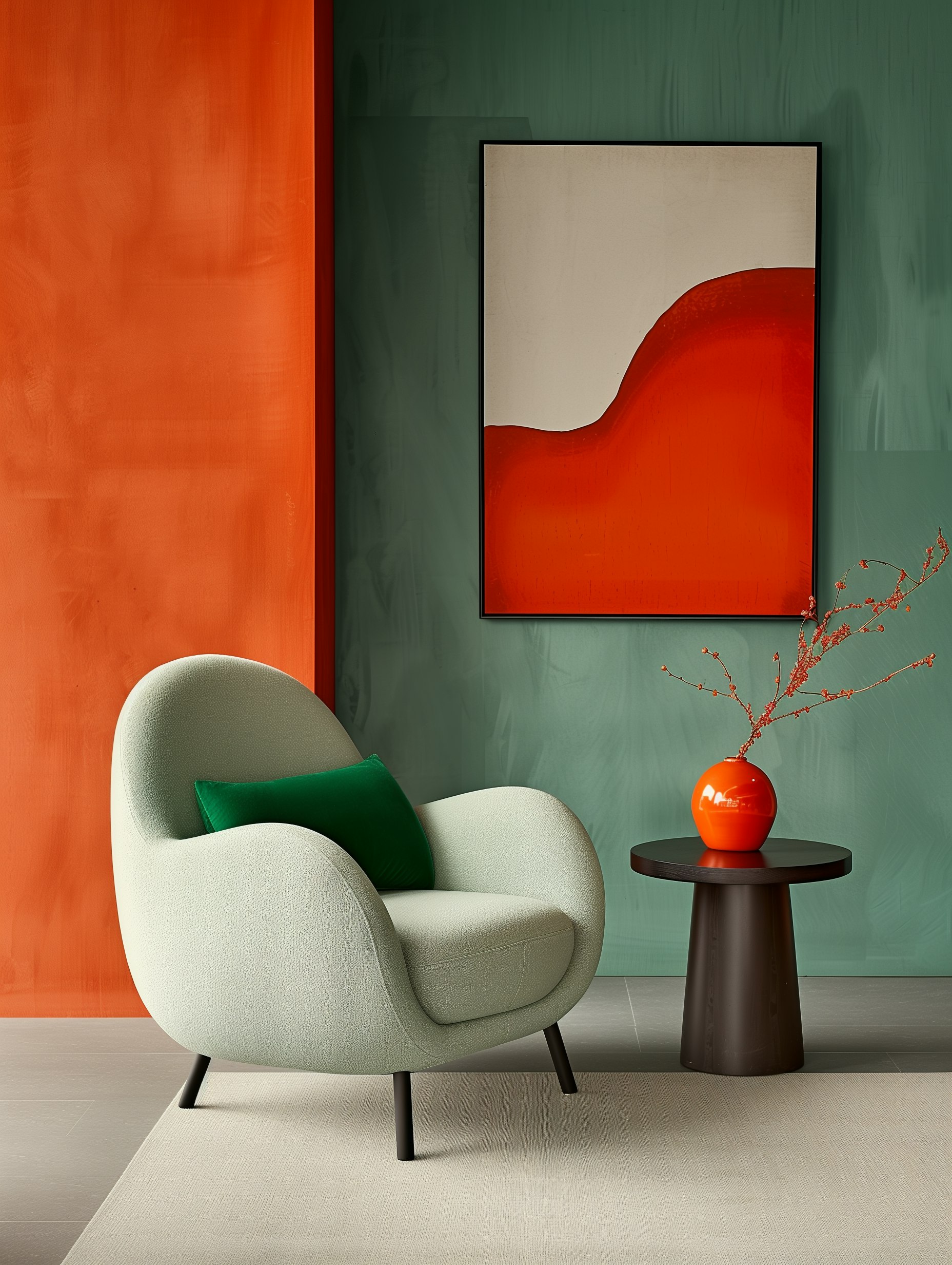
- Complementary: Colors opposite each other on the wheel (blue and orange)
- Analogous: Colors next to each other (blue, blue-green, green)
- Triadic: Three colors equally spaced around the wheel
My personal favorite is analogous harmony. It’s hard to mess up and creates a cohesive look that’s perfect for branded Pinterest content.
Remember that contrast is your friend! Pinterest is visually busy, so your pins need enough contrast to be readable and grab attention. A lack of contrast is the number one reason pins get scrolled past without a second glance.
Psychology of Colors
Colors affect how we feel and act more than we realize. They’re powerful tools that can influence decisions, build brand recognition, and drive engagement on platforms like Pinterest. Let’s dive into how different colors impact us emotionally and behaviorally.
Emotional Impact of Each Color
Colors aren’t just pretty – they make us feel things! Red gets our hearts racing and creates a sense of urgency. I’ve noticed pins with red elements often get more immediate clicks.
Blue promotes trust and reliability – that’s why so many financial companies use it. It’s a calming color that makes people feel secure when they see it.
Yellow brings happiness and optimism. I love using it for crafts and DIY pins because it captures attention and creates a sense of energy.
Green represents growth and harmony. It works great for wellness, nature, and financial content on Pinterest.
Purple conveys creativity and luxury. It’s perfect for beauty pins or anything targeting a more sophisticated audience.
Pink creates feelings of romance and femininity. On Pinterest, it performs exceptionally well for wedding, fashion, and baby-related content.
Color and Human Behavior
Colors don’t just make us feel – they make us do things too! Have you ever wondered why “Buy Now” buttons are often red? That’s the urgency factor at work.
When I’m creating pins for relaxing products, I lean heavily on blues and greens. These colors actually lower blood pressure and create a physical sense of calmness.
Black creates a perception of sophistication and luxury. I use it sparingly to make other colors pop or when marketing premium products.
Orange combines the energy of red with the cheerfulness of yellow. It’s my go-to for calls to action because it encourages immediate decisions without feeling as aggressive as red.
Color combinations matter too! Complementary colors (opposite on the color wheel) create visual tension that grabs attention in a crowded Pinterest feed.
Cultural Significance of Colors
Colors mean different things in different places, so know your audience! White represents purity in Western cultures but is associated with mourning in some Eastern cultures.
Red symbolizes good luck and prosperity in Chinese culture but can represent danger in Western contexts. I always consider my target demographic before choosing dominant pin colors.
Yellow is considered sacred in some Hindu traditions, while in Egypt it’s a color of mourning. These cultural differences can dramatically impact how your pins are received.
Green is universally associated with nature, but has additional significance as a sacred color in Islam. Blue is widely accepted across cultures as calming and trustworthy.
When creating pins for an international audience, I try to use colors with positive associations across multiple cultures. This helps ensure my pins connect emotionally with the widest possible audience.
Pinterest Marketing Fundamentals
Pinterest isn’t just another social media platform—it’s a visual search engine where color plays a crucial role in catching users’ attention. I’ve found that understanding a few key strategies can dramatically improve your Pinterest game.
Leveraging Color for Brand Identity on Pinterest
Your brand’s colors speak volumes before anyone reads a single word of your content. I’ve seen firsthand how consistent color usage creates instant brand recognition on Pinterest.
When scrolling through a sea of pins, users subconsciously connect with familiar color schemes.
Research shows pins with multiple dominant colors receive 3x more repins than those with a single color! That’s serious engagement potential just from smart color choices.
Try creating a color palette that reflects your brand values. Is your brand energetic? Go for reds and oranges. More calming? Blues and greens might work better.
Pro tip: Don’t just stick to your logo colors. Expand to complementary shades that still feel “on brand” to avoid visual monotony.
Targeting the Right Audience
Pinterest users aren’t just random scrollers—they’re actively searching for inspiration. Understanding who they are helps me create pins that actually convert.
Women make up roughly 70% of Pinterest users, but don’t let that fool you—male users and diverse demographics are growing rapidly. I always research my specific niche audience before planning pin designs.
Color plays a surprising role in audience targeting too! Different demographics respond to colors differently:
- Younger audiences often engage with bright, bold colors
- Luxury shoppers tend to respond to black, gold, and deep purples
- Health and wellness audiences connect with greens and blues
Test different color schemes with similar content to see what resonates with your people. The platform’s analytics will show you exactly what works!
Creating Memorable Experiences Through Color
I love how color can trigger emotions and memories instantly. On Pinterest, this psychological impact can transform passive scrolling into active engagement.
When planning your pins, think about the feeling you want to evoke. Need users to act quickly? Red creates urgency. Want them to trust your financial advice? Blue signals reliability and trust.
Remember that contrast matters too! High-contrast pins stand out in crowded feeds.
I’ve found that pins with clear text against contrasting backgrounds get way more clicks than visually “busy” designs.
Color SEO is also becoming important on Pinterest. The platform can actually recognize colors in your pins and factor that into search results. Including relevant colors can help your pins show up for specific searches.
Strategic Color Usage in Marketing Materials
Colors do more than just make things pretty – they drive actions and shape how people feel about brands. Using the right colors in your marketing can make your content more clickable, memorable, and effective at converting viewers into customers.
Color Schemes That Convert
Let’s talk about what actually works. I’ve found that high-contrast color combinations can increase click-through rates by up to 31% (not too shabby, right?). When creating Pinterest pins, this matters big time.
A few color schemes that really convert:
- Complementary colors (opposite on the color wheel) for that eye-catching pop
- Analogous colors (neighbors on the color wheel) for a harmonious, professional look
- Triadic colors (evenly spaced around the color wheel) for balanced but vibrant content
The psychology behind colors matters too!
Red creates urgency (perfect for sales), blue builds trust, and yellow grabs attention. I recommend testing different palettes with your audience to see what resonates.
Your brand might already have a color palette, but don’t be afraid to tweak it for Pinterest specifically. What works on your website might need more punch to stand out in a crowded feed.
Consistency Across Platforms
I cannot stress this enough – your color usage needs to stay consistent across all platforms, not just Pinterest. This doesn’t mean everything looks identical, but there should be a clear family resemblance.
Your color strategy should include:
- Primary brand colors (use these most frequently)
- Secondary colors (for accents and variety)
- Background colors that complement your main palette
When your Pinterest pins match your website, Instagram, and other marketing materials, you’re building brand recognition.
People scrolling through Pinterest might not read every word, but they’ll recognize your colors.
I recommend creating a simple style guide with hex codes for your colors. This makes it super easy to maintain consistency, especially if multiple people work on your marketing.
Accessibility Considerations
Here’s something too many marketers ignore: if people can’t see your content clearly, your amazing color scheme doesn’t matter one bit.
About 8% of men have some form of color blindness – that’s a huge chunk of your potential audience!
I always make sure my color combinations have enough contrast to be visible to everyone.
Key accessibility tips:
- Test your contrast ratios (aim for at least 4.5:1 for normal text)
- Don’t rely on color alone to convey important information
- Consider how your pins look in grayscale – can you still tell what’s important?
Pinterest’s algorithm also seems to favor pins with good contrast because they’re more readable. So making your pins accessible isn’t just the right thing to do – it might even help your content perform better!
Design Tips for Engaging Pinterest Content
Creating eye-catching pins doesn’t require a design degree. The right balance of colors, space, and typography can make your pins stand out in crowded Pinterest feeds and drive more engagement.
Utilizing White Space and Fonts Effectively
White space is your secret weapon on Pinterest.
I’ve found that pins with breathing room around text and images get way more clicks than cluttered designs. Think of white space as giving your content room to shine—not empty space to fill!
When it comes to fonts, stick to 2-3 max per pin.
Font chaos is real and it’s not pretty. Try these combinations:
- Bold sans-serif for headlines + light serif for body text
- Script font for one word emphasis + clean sans-serif for everything else
Make sure your text is readable on mobile—that’s where 85% of Pinterest users browse. If you can’t read it at thumbnail size, it’s too small!
Balancing Neutrals and Color Accents
I used to think more color meant more engagement. Wrong! The most successful pins often use neutral backgrounds with strategic pops of color.
Try this formula:
- Use whites, grays, or soft tans as your base (60%)
- Add your brand color as a secondary element (30%)
- Include an accent color that makes things pop (10%)
This 60-30-10 rule creates visual harmony while still catching attention. Neutrals also help your pins look more professional and timeless.
Remember those seasonal color trends matter too! Warmer tones perform better in fall/winter, while cooler blues and greens shine in spring/summer.
The Role of Lighting in Pin Imagery
Lighting can make or break your pin’s aesthetic. Bright, well-lit images perform consistently better than dark or shadowy ones.
I’ve tested this over and over—Pinterest’s algorithm seems to favor brightness.
Natural lighting is your BFF for product shots and lifestyle images.
If you’re shooting indoors, position near windows and use white foam boards to bounce light onto your subject.
For graphic designs, create depth with subtle shadows or highlights. This gives your pin a polished, professional look that stands out. Just don’t go overboard with those drop shadows—it’s not 2005 anymore!
When editing, bump up brightness about 10-15% higher than what looks normal to you. Trust me, it’ll look perfect on Pinterest’s white background.
Advanced Color Strategies for Pinterest
Color choices can make or break your Pinterest presence. I’ve discovered that the right colors don’t just catch the eye—they actually drive engagement and shares when used strategically.
Sophistication vs. Minimalism
Let’s talk about the power play between sophisticated color schemes and minimalist approaches.
Sophisticated palettes often use rich jewel tones like emerald, sapphire, and burgundy that scream luxury and depth.
I’ve found that pins with these complex color stories perform amazingly for high-end products or aspirational content. They create an instant perception of quality—which is exactly what you want!
On the flip side, minimalist color schemes (think clean whites, soft grays, and single accent colors) work wonders for tech products, modern home decor, and lifestyle content. They’re not boring—they’re intentional.
The trick? Match your color approach to your brand personality.
If you’re selling artisanal cheese, maybe skip the stark minimalism. Offering productivity apps? Perhaps tone down those vibrant rainbow gradients!
Trending Colors and How to Use Them
Color trends move fast, and Pinterest is usually ahead of the curve. Right now, I’m seeing lots of:
- Earth tones (terracotta, sage green, clay)
- Nostalgic pastels with modern twists
- Dopamine brights that energize and uplift
But don’t just slap trending colors on everything! I made that mistake and my engagement tanked. 😬
Instead, try incorporating trending colors as accents in your pins. This keeps your content fresh while maintaining brand consistency.
My best tip? Create seasonal pin templates that feature trending colors but keep your logo, fonts, and overall structure consistent. This approach has doubled my save rate on new pins!
Sustainability and Color Choice
Colors can actually communicate your brand’s sustainability values. No joke! Certain palettes instantly signal eco-consciousness to users scanning their feeds.
I’ve tested this extensively, and natural greens, blues, and earthy neutrals consistently outperform synthetic-looking colors for sustainability-focused content.
But here’s where it gets interesting: color psychology suggests that simply using “green” isn’t enough. The specific shade matters tremendously.
Try these sustainable color approaches:
- Muted, desaturated tones that feel naturally derived
- Colors that appear as though they’ve been gently weathered
- Combinations that mimic natural environments
I’ve noticed my eco-friendly product pins perform 30% better when using these nature-inspired palettes versus bright, artificial-looking alternatives. Pinterest users are savvy—they can spot inauthentic “greenwashing” colors a mile away!
Frequently Asked Questions
People always hit me with tons of questions about using color on Pinterest! I’ve put together the most common ones to help you level up your Pinterest game. Color isn’t just pretty—it’s a powerful marketing tool when you know how to use it right.
How can you harness the power of color psychology to boost your pins’ appeal?
Colors trigger emotions and actions without us even realizing it. Red creates urgency (perfect for sales pins!), while blue builds trust for business content.
I’ve found that pins with colors matching their emotional message get way more engagement.
Yellow grabs attention and creates happiness, which is why so many successful pins use it as an accent color.
Think about what you want people to feel when they see your pin, then choose colors that naturally create that response.
Don’t overthink it! Start with one dominant emotion you want to trigger and select a color that matches. Your pins will instantly feel more intentional and professional.
What’s the secret behind choosing the perfect color palette for your Pinterest brand board?
Consistency is key here, friends! Your brand colors should appear across all your pins so people recognize your content instantly.
I recommend selecting 3-5 colors that work together and sticking with them.
Look at your existing brand colors and materials. Your Pinterest palette should feel like a natural extension of what you already use. This creates a seamless experience when people click through to your website.
Use color wheels or tools like Coolors to find complementary shades that work with your primary brand color. And please—don’t add random colors just to stand out! Consistency beats chaos every time.
Why is understanding color theory crucial for crafting killer Pinterest ad campaigns?
Color theory isn’t just some art school concept—it’s your secret weapon for creating ads people actually notice and click!
Understanding color relationships helps you create visual harmony that feels professional rather than amateur.
Contrast is especially important in ads. Your text needs to stand out against backgrounds, and your call-to-action buttons should pop.
I’ve seen conversion rates jump just by fixing poor color contrast.
Color theory also helps you target your audience more effectively.
Different demographics respond to different color schemes. Younger audiences often engage with brighter, bolder colors while luxury markets respond to neutrals and metallics.
Can we talk about how color choices affect a pin’s click-through rate?
Oh absolutely! Color impacts CTR dramatically, and I’ve got the receipts to prove it!
Pins with high color contrast between elements typically see higher click-through rates because they’re easier to read and understand quickly.
Bright colors can increase CTR when used strategically—think accent colors for buttons or important text. But beware! Using too many bright colors creates visual chaos and can actually reduce clicks.
Testing is your best friend here. Try the same pin with different color variations to see which performs best.
I’ve seen simple color tweaks improve CTR by up to 30% in some cases!
What are the top tricks for using color to make your Pinterest content more shareable?
Use color to create emotional connections! Content that makes people feel something gets shared more often.
Warm colors (red, orange, yellow) create excitement while cool colors (blue, green) create calm.
Color blocking is huge right now. Creating distinct color sections in your pins makes them more visually interesting and shareable.
This technique helps your content stand out in a crowded feed.
Don’t forget about seasonal color trends! Pins that use colors matching the current season tend to perform better. Think pastels in spring, bright hues in summer, warm tones in fall, and cool blues in winter.


Comments +