


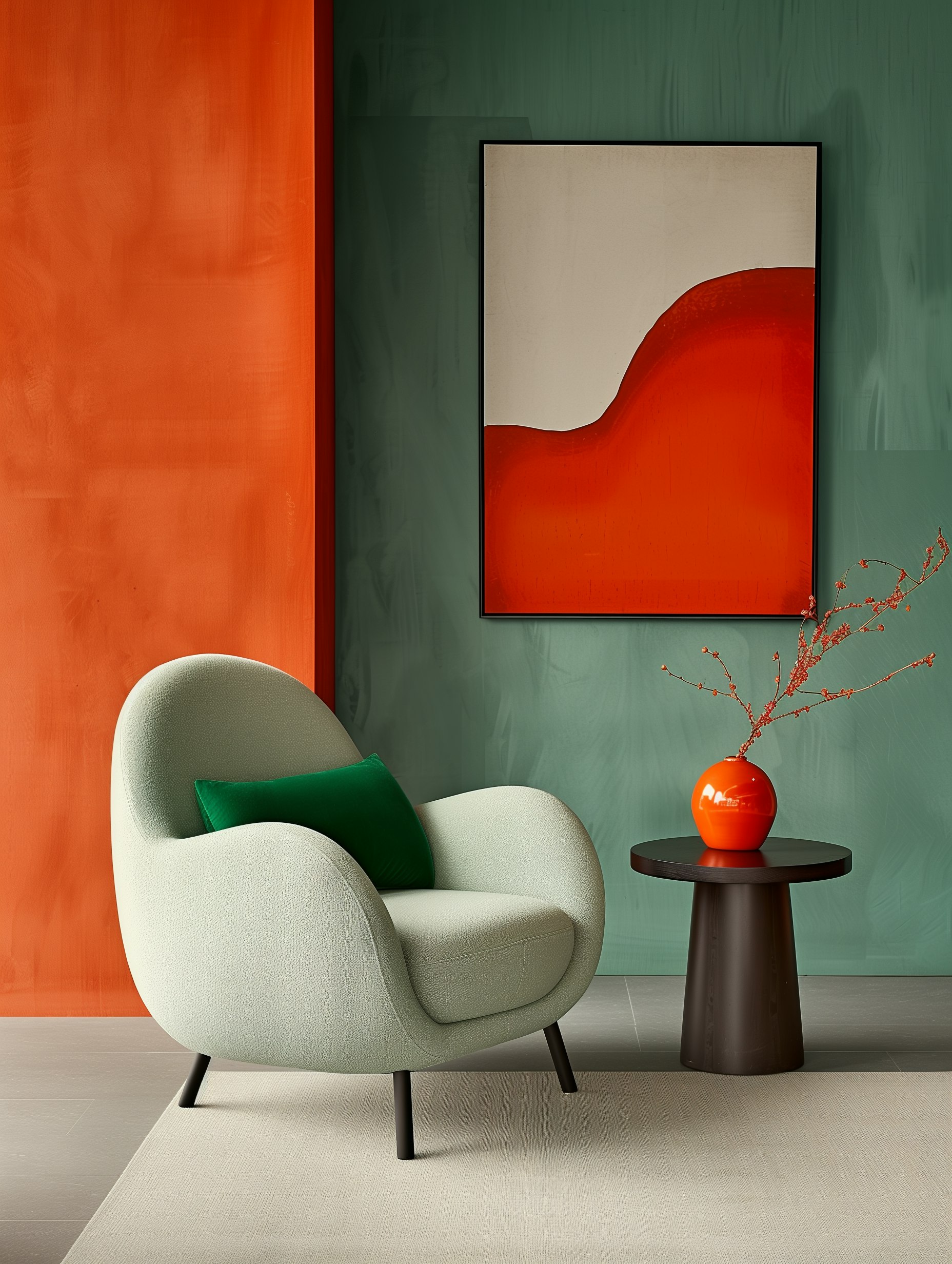
Let’s talk about the secret weapon that can make or break your pin design: fonts.
Your choice of typography does more than just share words – it sets the mood, grabs attention, and tells your audience what you’re all about.
The right font combination for Pinterest pins needs to be eye-catching and super readable at a quick glance.
When I create pins, I think of fonts as my visual voice. A messy or hard-to-read font is like mumbling – nobody’s going to stick around to figure out what you’re trying to say.
You don’t need to be a design pro to pick great fonts.
A good starting point is pairing a bold header font with a clean, simple font for your details. Trust me, your pins will thank you for not using Papyrus.
Key Takeaways
- Strategic font choices on Pinterest can significantly boost engagement and clicks by making your message instantly clear.
- Pairing bold header fonts with simple body text creates visual hierarchy that guides viewers through your content.
- Readable typography functions as your visual voice on the platform, communicating your brand personality even before users read the words.
Using Text to Create Pins That Get Noticed
Making Your Pinterest Words Pop
Pinterest is a visual world where your pins need to catch eyes fast. I’ve learned that good text can make or break a pin. When I’m scrolling through my feed, I only stop when something grabs my attention in a split second.
The platform loves clean, readable text that stands out. Your words need to work like a mini-billboard – easy to read even when someone’s thumb is flying up their screen. I’ve found that bold headlines with simple messages work best for stopping the scroll.
When creating pins for your boards or group boards, remember that most people see your content on phones, not big computer screens. This means your text needs to be clear at small sizes.
Fonts That Get Results
I’ve tested tons of fonts, and here’s what works:
- Keep it simple – Sans-serif fonts win on Pinterest
- Limit yourself – Use just 1-2 fonts per pin
- Size matters – Make headlines at least 30-40 pixels
Don’t overcomplicate your Pinterest marketing with fancy fonts. I used to make this mistake! Plain fonts like Arial or Helvetica actually perform better because they’re easy to read quickly.
Text contrast is super important too. Dark text on light backgrounds (or vice versa) makes your pins pop. I’ve seen my engagement numbers tank when using text that blends into the background.
For this visual platform, I recommend:
- Bold text for your main message
- Larger size for important words
- Breaking text into chunks (no more than 5-7 words per line)
- Using white space to let your message breathe
Crafting Your Message
Setting the Right Tone
I’ve found that the words on your Pinterest pins need to feel like you’re talking directly to your friend. Don’t be all stiff and formal! Write like you’re texting someone you actually like.
When I create pins for recipes or tutorials, I keep things light and friendly. Nobody wants to feel like they’re reading a textbook when looking for a cookie recipe, right?
Try these tone tips:
- Be conversational – “Hey, want to make the fluffiest pancakes ever?”
- Add personality – “This DIY shelf saved my cluttered bathroom (and my sanity)”
- Test different approaches with your audience to see what clicks
Remember to match your voice to what you’re sharing. My baking tutorials use a different tone than my budgeting pins, and that’s okay!
Making Text Match Your Content
Let’s be real – nothing’s more annoying than clicking on a gorgeous pin only to find it has nothing to do with what was promised. Your text needs to deliver exactly what people will get.
For effective pins:
- Create a headline that grabs attention
- Add 1-2 points that make readers curious
- Include a clear next step
When I share a tutorial for homemade pasta, my text focuses on how simple the recipe is—not random cooking facts. The image and words need to tell the same story.
Want to know if your text works? Read it out loud! If I stumble over my words or run out of breath, that’s a sign I need to simplify things.
Text That Grabs Attention
Making Your Words Stand Out
Let’s talk about text on Pinterest! The right typography can make people stop scrolling and actually click on your pins. I’ve found that thoughtful text design is often what separates pins that perform well from those that flop.
Text hierarchy is super important. Make your main message BIG and BOLD – it should hit viewers right away! I like to use font sizes that clearly show what’s most important. Your headline should be at least twice as large as any supporting text.
Keep smaller text simple with clean fonts. Those fancy script fonts might look cute, but they’re usually hard to read at small sizes. Break up your text into small chunks too – nobody wants to read a wall of words on Pinterest!
Making Text Pop
Ever seen pins where you can barely read the words? Yeah, that’s a fail. Your text needs to stand out against your background image. Here’s what works:
- Dark text on light backgrounds
- Light text on dark backgrounds
- Text with a slight shadow or outline
- Semi-transparent overlay behind text
I always test my pins on my phone before posting. If I have to squint to read it, I know it needs fixing!
Bold color choices for text can really make your pins pop, but make sure they match your brand. Red, blue, and black tend to work well, but don’t be afraid to experiment with what fits your photography style.
Design Principles for Pin Typography
Your text design can make or break your Pinterest pins. Great typography catches eyes and drives clicks, while poor text choices will have people scrolling right past your content.
Hierarchy and Visual Flow
I’ve learned that creating clear visual importance in your text is crucial for Pinterest success. Make your main message stand out with larger, bolder text that grabs attention first!
Here’s what works for me:
- Main headline: Big and bold (2-3× larger than other text)
- Supporting text: Clean and simple
- Text placement: Top to bottom flow
Sans-serif fonts like Helvetica work best for smaller text because they’re easier to read quickly. I always break longer messages into 2-3 short lines instead of one long sentence—it’s so much easier for people to digest!
Color and Contrast
Nothing kills a pin faster than text you can’t read! I always make sure my words pop against my photography with strong contrast:
- Use dark text on light backgrounds (or vice versa)
- Add semi-transparent overlays between images and text
- Choose bold text colors that match your brand
When I’m stuck, I go with simple black or white text—they almost always work! Before posting, I check my pins on my phone screen. If I can’t easily read it there, neither can my audience. Trust me, this quick check saves so many pins from poor performance!
Font Magic for Better Pins
Picking Fonts That Match Your Vibe
Let’s face it – fonts say a lot about who you are. When I choose fonts for my pins, I think about what message I want to send. Running a fitness account? Bold, strong fonts make sense. Sharing recipes? Something a bit more friendly and rounded might work better.
I’ve learned the hard way that less is definitely more. Stick to 2 fonts max on your pins – trust me, your viewers will thank you! When I went font-crazy early on, my engagement dropped like a rock.
Before finalizing any design, I always check how it looks on my phone. What seems perfect on my laptop sometimes turns into a blurry mess on mobile!
My Quick Font Tips:
- Create a small collection of go-to fonts
- Stay consistent across pins
- Test readability at small sizes
Mixing Fonts That Actually Look Good Together
Finding fonts that play nice together is like matchmaking. I’ve had great success pairing a strong, attention-grabbing headline font with something simpler for the details.
Some combos I swear by:
| Main Font Type | Paired With | Works For |
|---|---|---|
| Bold serif | Light sans-serif | Professional pins |
| Playful script | Clean sans-serif | Lifestyle content |
| Heavy block letters | Thin minimalist font | Collaborations & announcements |
I never, ever use two fancy fonts together – it’s like two people shouting at once! For collaborations with other creators, I find using one font from each brand creates a nice blend that respects both identities.
Remember to create contrast through size too! I make my headlines at least twice as big as my other text to guide the eye exactly where I want it to go.
Text Overlays That Catch People’s Attention
Catchy Titles That Work
Want your Pinterest pins to stop scrollers in their tracks? A good headline makes all the difference! I’ve found that adding text to your images boosts engagement by up to 25% – people simply notice them more.
Try these winning title patterns:
- “7 Quick Ways to _____”
- “How I _____ in Just One Weekend”
- “The Only _____ Guide You’ll Need”
Numbers work like magic because they tell people exactly what to expect. Who can resist “3 Kitchen Hacks That Saved My Mornings”?
Don’t be afraid to use powerful words that spark feelings. Words like “incredible,” “easy,” or “game-changing” can make your pins more clickable – just keep it real and don’t promise what you can’t deliver!
Short Messages Win Every Time
Let’s be honest – nobody’s stopping to read paragraphs on Pinterest. Keep your text short enough to read in seconds!
My top tricks for keeping text brief:
- Cut extra words (especially “that” and “very”)
- Use numbers instead of writing them out
- Choose shorter words when possible
- Stick to 2-3 lines max
White space is seriously your best friend on infographics. Let your text breathe!
Put your most important words at the top or bottom of your pin – these are the spots people notice first when they’re speed-scrolling through their feed like there’s no tomorrow.
Making Your Pins Easy to Read
Big Enough Text
Let’s talk about text size – it’s more important than you might think! When I’m scrolling through Pinterest on my phone, I instantly skip pins with tiny text I can’t read. Aim for headlines that are at least 30-40 pixels tall. Your smaller text should stay around 20-24 pixels.
Quick test: Pull up your pin on your phone and hold it at normal distance. Can you read it while scrolling quickly? If not, make that text bigger!
I like to follow this simple rule – make your headline take up about 1/3 of your pin’s height. This helps it stand out as people speed-scroll through their feeds.
Room to Breathe
Text needs space to be readable! When lines of text are too close together, your brain works overtime trying to separate them.
Here’s what works:
- Add padding between lines (about 120-150% of your font size)
- Center alignment creates a clean, balanced look on pins
- Break text into small chunks rather than one big block
My favorite trick: Think of your pin as divided into thirds. Place important text at those intersection points – it’s weirdly effective at making your pin more visually appealing!
Remember, nobody’s going to stop and squint at your pin. If they can’t read it instantly, they’ll just keep scrolling.
How to Make Pins That Actually Look Good
Image Quality and Dimensions That Pop
Let’s talk pixels, friends! For Pinterest, size really does matter.
Aim for 1000 x 1500 pixels with a 2:3 ratio. This taller shape fits perfectly in Pinterest’s vertical feed and gives your content room to shine.
Want to go taller? You can stretch to a 1:2.1 ratio (1080 x 1920 pixels), but don’t go overboard or Pinterest will chop off your masterpiece! I’ve learned this the hard way, trust me.
For e-commerce and product pins, crystal clear images are non-negotiable.
Shoot for at least 72 DPI resolution so your buyable pins look drool-worthy on any device. Remember, blurry images = fewer clicks = sad you.
Quick Size Checklist:
- Standard pin: 1000 x 1500 pixels (2:3 ratio)
- Maximum height: 1:2.1 ratio
- Minimum quality: 72 DPI
File Types That Won’t Break Your Pin
Picking the right file format can make or break your Pinterest game, especially for promoted and rich pins where quality matters.
Best formats for different pin types:
| Pin Type | Recommended Format | Why It Works |
|---|---|---|
| Product photos | JPG | Great for compression without losing detail |
| Text-heavy designs | PNG | Keeps text crisp and readable |
| Publishing content | Either | Depends on image vs. text ratio |
Keep your files under 10MB – nobody’s waiting around for your giant pin to load!
I use compression tools all the time to slim down files without making them look terrible.
Pro tip I wish someone told me earlier: Always save pins with text overlay as PNGs.
Your fonts will stay sharp and readable, which is super important for those buyable pins where you want people to see the price!
Test your pins on both your phone and computer before publishing. What looks amazing on your laptop might look like digital garbage on mobile.
Making Your Pins Work for Everyone
Pin Design for All Users
Want your pins to reach more people? Make them easy for everyone to use!
Pick fonts like Arial or Open Sans that are super readable. I’ve found that bigger is definitely better – aim for headlines at 30px and regular text at 20px minimum, especially since most folks browse Pinterest on their phones.
Break your text into bite-sized chunks. Nobody wants to read a wall of text on Pinterest! Use different sizes to guide people’s eyes to what matters most.
Quick Tip: Don’t forget alt text! It’s a simple way to describe your images to people who can’t see them. Here’s how to add it:
- Upload your pin
- Click the edit button
- Find the alt text field
- Write a clear description of what’s in your image
Colors That Everyone Can See
Choose colors that pop against each other! Black text on white backgrounds is a classic for a reason – it’s super easy to read.
If you want to check if your colors work well together, aim for these contrast ratios:
| Text Size | Minimum Contrast Ratio |
|---|---|
| Large text | 3:1 |
| Regular text | 4.5:1 |
I’ve made the mistake of using these hard-to-read combos before (don’t be like me!):
- Yellow text on white backgrounds (practically invisible)
- Light gray on white (where did my text go?)
- Red on green (Christmas colors are festive but terrible for readability)
Not everyone sees colors the same way. About 8% of men have some form of color blindness!
Try running your designs through a color blindness simulator before posting. And remember – don’t rely just on color to show important stuff. Add icons or labels too!
Making Typography Work for Your Brand
Typography is a big deal on Pinterest. The fonts you choose say a lot about who you are as a brand.
Building Your Font Identity
I’ve found that picking 2-3 key fonts can transform how people see your content.
Your fonts should match what your brand is all about – playful scripts for fun brands, clean lines for more serious ones.
Think about what you want your audience to feel when they see your pins. Are you:
- Bold and confident? Try strong sans-serifs
- Creative and unique? Mix in a decorative font for headlines
- Professional and trustworthy? Stick with classic, readable choices
Remember that your headline font is like your brand’s signature. It needs to grab attention quickly while still being readable on small screens.
Keeping Your Font Game Consistent
I can’t stress this enough – using the same fonts across all your pins helps your target audience recognize your content instantly.
It’s like wearing the same perfume – people start to associate that “scent” with you.
Make yourself a simple guide:
- Pick your headline font
- Choose your body text font
- Decide on sizes for each
- Save examples for quick reference
When creators maintain font consistency, it builds brand awareness without saying a word. Your pins become instantly recognizable, which drives more referral traffic back to your site.
Don’t put your logo on everything, though. Sometimes letting your typography speak for your brand is more powerful than plastering your name everywhere.
Looking at Pinterest Font Choices
Today’s Font Favorites
I’ve been digging through Pinterest’s analytics lately, and wow – typography is seriously shaping how well pins perform!
In 2025, we’re seeing bold text stealing the spotlight. Creators are pairing simple sans-serif fonts with funky display fonts to make pins pop.
What’s working right now:
- Minimalist sans-serif fonts (Helvetica, Montserrat) for readability
- Statement display fonts for headlines that grab attention
- Super-sized text with fewer words (quality over quantity!)
Pinterest’s data shows pins with clean, legible text get higher engagement rates. No surprise there – nobody wants to squint at tiny text while scrolling!
I’ve noticed my own pins perform better when I keep text brief and bold.
What’s Coming Next in Pin Typography
Looking at Pinterest Trends data, I can confidently say experimental typography isn’t going anywhere. Searches for unique font pairings are up a whopping 85%!
If you want to stay ahead, try these emerging styles:
Retro comeback fonts:
- 70s-inspired groovy lettering
- Art deco elegance
Hand-drawn, organic styles that feel authentic and personal
For SEO wins, remember Pinterest’s algorithm favors readable content.
My secret formula? One attention-grabbing headline font + one simple font for details = pin perfection!
The statistics don’t lie – pins with 3-5 words in dynamic typography get more saves and clicks than text-heavy designs.
I’m already adapting my strategy, and I suggest you do too. Who has time to read a novel on a pin anyway?
Pin Design Tips That Actually Work
Helpful Design Tools You Should Try
Let’s face it—not all of us are graphic design wizards. That’s why I rely on tools like Canva and PicMonkey when creating my Pinterest pins.
These platforms offer ready-made templates that take the guesswork out of font pairing.
Speaking of fonts, here are some killer combinations that always look professional:
- Montserrat + Open Sans (clean and modern)
- Playfair Display + Raleway (elegant with a touch of flair)
- Roboto + Lato (simple and highly readable)
Pro tip: Create templates with your favorite font pairings and save them for future use.
This will save you tons of time and keep your pins looking consistent—which helps people recognize your brand instantly!
Text Mistakes That Kill Your Pins
I’ve seen way too many Pinterest fails caused by simple typography errors. Don’t be that person! Here’s what to avoid:
- Using a font party (stick to 2-3 fonts max)
- Choosing fonts that look nearly identical (what’s the point?)
- Making text so tiny that people need a magnifying glass
- Using fancy script fonts for important words (nobody can read them!)
Always check that your text stands out against the background. Dark text on light backgrounds (or the reverse) creates the contrast you need.
Quick test: Look at your pin on your phone. If you struggle to read it, your audience will too.
And please, give your text some breathing room! Cramped design makes pins look amateur and messy.
Frequently Asked Questions
How Do I Pick Amazing Fonts for My Pinterest Pins?
Let’s be real—fonts can make your Pin go from “meh” to “wow!” I’ve found that pairing two complementary fonts works like magic.
Try matching a bold, attention-grabbing font for your headline with a clean, simple sans-serif for your details.
Your headline font should reflect your brand’s personality. Want to look fancy? Go for a script font. Need something modern and clean? A geometric font will do the trick.
Remember, your fonts tell people who you are before they even read the words!
What Size and Format Will Make My Pins Stand Out?
I always stick to the 1000 x 1500 pixel size with a 2:3 ratio. This vertical format takes up more real estate in the feed, which means more eyeballs on your content!
Make sure your text is large enough for mobile scrollers—at least 30pt for headlines and 20pt for body text.
Nobody’s going to squint to read your amazing content, trust me.
How Can I Create Stunning Pinterest Pins?
Keep it simple! A cluttered Pin is a forgotten Pin. Here’s my go-to checklist:
- Embrace white space—it’s not wasted space!
- Limit yourself to 2-3 fonts per Pin
- Create contrast between text and background
- Use colors that pop but still feel on-brand
Remember, Pinterest is a visual platform. If your Pin doesn’t look good at first glance, people won’t stop scrolling for it.
How Do I Experiment with Fonts Without Getting Overwhelmed?
Create your own font palette with 2-3 reliable options that work for your brand.
This saves you time and keeps your Pinterest presence looking cohesive.
Pro tip: Test your fonts at different sizes! Some fonts look amazing as headlines but become totally unreadable when you shrink them down for body text.
Where Can I Find Free Pinterest-Worthy Fonts?
Who says you need to break the bank for great typography? Check out:
Creative Market: They offer free fonts every week. These are perfect for spicing up your Pins.
Google Fonts: A treasure trove of free options. They look professional and load quickly.
How Can I Use Google Fonts to Elevate My Pinterest Game?
I love using Google Fonts for Pinterest. Download them to use in your design software for the best quality.
Try these winning combinations:
- Playfair Display + Roboto
- Montserrat + Lora
- Oswald + Open Sans
For a super cohesive look, stick with different weights from the same font family. It keeps things consistent while still giving you visual hierarchy.


Comments +